
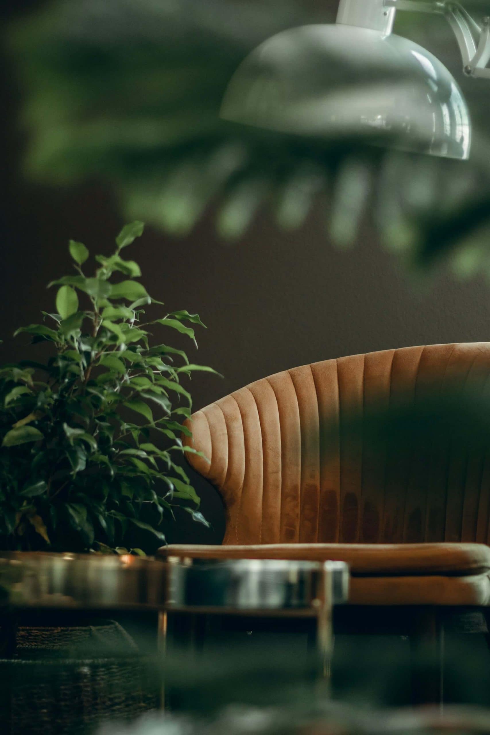
Benjamin Moore has named Webster Green its Colour of the Year for 2027, and honestly, it makes so much sense. Green has been quietly holding its place in our homes for years, but this particular shade feels like a fresh little reset.
Webster Green is a rich, mid-tone green with a grounded, heritage feel. It has that traditional “old house” comfort to it, but it still looks right at home in a modern space. If you love timeless interiors, cosy rooms, and colours that feel like they belong in the countryside, this one is going to be hard to resist.
What does Webster Green look like?
Think of Webster Green as the colour you get when you mix classic English country style with a clean, contemporary finish.
It is:
- Deep and earthy without being too dark
- Warm and familiar rather than sharp or trendy
- Full of character in both natural and artificial light
It sits in that sweet spot where it can be a statement colour, but it can also act like a neutral when you style it the right way.

Why green keeps coming back in interiors
There is a reason green never really disappears from design. It is tied so closely to nature, and it brings a sense of calm that is hard to replicate with other colours.
In a home, green can feel:
- Restful and steady
- Comforting and lived-in
- Fresh without being bright
Webster Green leans into that feeling, but with a more heritage-inspired twist. It is the kind of shade that looks like it has always been there.
The heritage-inspired appeal of Webster Green
This is where Webster Green really shines. It has that traditional, slightly historic look that works beautifully in older homes, cottages, and farmhouse-style spaces.
If you love:
- Panelled walls
- Painted dressers and cupboards
- Vintage furniture
- Classic prints like checks and florals
…then Webster Green will fit right in.
But it is not just for traditional homes. In a more contemporary setting, it adds warmth and depth, especially when paired with modern shapes and clean lines.
Where to use Webster Green in your home
If you are not sure where to start, here are a few easy ways to bring Webster Green into your space.
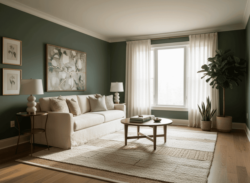
1. A cosy living room
Webster Green is perfect for living rooms because it creates that snug, settled feeling, especially in the evenings.
Try it on:
- A feature wall behind the sofa
- Built-in shelving
- A fireplace surround
Pair it with warm neutrals like cream, oatmeal, and soft beige, then add texture with wool throws, linen cushions, and natural wood.
2. A kitchen with character
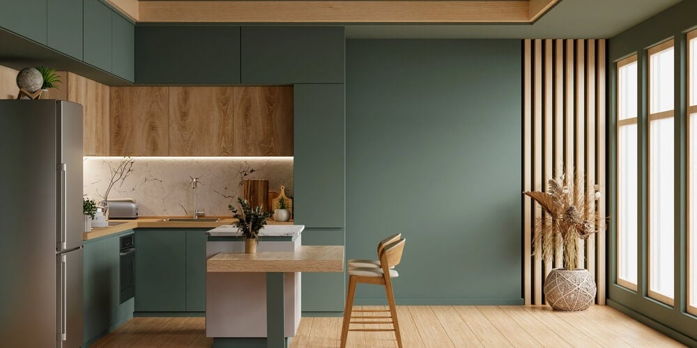
Green kitchens are not going anywhere, and Webster Green is a lovely choice if you want something classic rather than overly bold.
It looks beautiful on:
- Lower cabinets
- A kitchen island
- A pantry door
Style it with brass or antique-style hardware, warm wood worktops, and creamy tiles for that timeless country look.
3. A calm bedroom
If you want your bedroom to feel like a retreat, Webster Green can be a great option.
Use it on:
- The wall behind the bed
- All four walls if you want a cocooning feel
- Wardrobes or a chest of drawers for a smaller commitment
Add soft white bedding, warm lighting, and a few natural touches like rattan, oak, or dried flowers.

4. A welcoming hallway
Hallways are such an underrated place to use deeper colour. Webster Green can make an entrance feel warm and inviting, especially if your hallway is a bit bland.
If you are nervous about going too dark, try it on:
- The lower half of the wall with panelling
- Doors and trim
- A statement front door
5. Furniture and smaller accents
Not ready to paint a whole room? Webster Green works brilliantly on furniture.
Ideas to try:
- A dresser in the dining room
- A bedside table makeover
- A bookcase or shelving unit
- Plant pots, lampshades, or picture frames in similar tones
It is a great way to test the colour and see how it behaves in your light.
What colours go with Webster Green?
This shade is surprisingly flexible. It can lean classic, rustic, or modern depending on what you pair it with.
Here are some combinations that work especially well:
- Cream and off-white for a soft, timeless look
- Warm wood tones like oak, walnut, and pine
- Brass and gold accents for a slightly elevated feel
- Terracotta and clay tones to bring out the warmth
- Soft blush or dusty pink for a gentle, cottage-style palette
- Black accents for a sharper, modern contrast
If you want it to feel extra heritage, add pattern. Think ticking stripe, gingham, small florals, or even a classic William Morris style print.
A quick note on light (because it matters)
Mid-tone greens can shift a lot depending on the direction your room faces.
- In north-facing rooms, Webster Green may feel cooler and slightly moodier.
- In south-facing rooms, it will look warmer and more welcoming.
If you can, test a sample in a few spots and look at it throughout the day. It is always worth it.
Is Webster Green a trend, or a timeless choice?
Even though it is Benjamin Moore’s Colour of the Year for 2027, Webster Green does not feel like a “flash in the pan” colour.
It is the kind of shade that will still look good in five or ten years, especially if you love that countryside, heritage-inspired style. It brings depth without drama, and it makes a home feel a little more grounded and cared for.
Final thoughts
If you are craving a colour that feels classic but still current, Webster Green is such a lovely option. It is rich, familiar, and full of character, and it works beautifully across so many rooms.
If you try it in your home, I would love to know where you use it. Are you thinking kitchen cabinets, a cosy living room, or maybe a hallway refresh?